


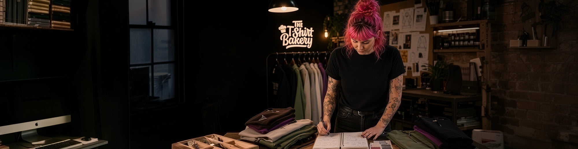
🎨 File Prep 101: How to Set Up Artwork for DTG Printing
🧩 Your Design Is Only Half the Story
A great idea is a strong start, but when it comes to t-shirt printing in the UK, your design file is just as important as your artwork concept. Direct-to-Garment (DTG) printing demands more than a slick design. If the file itself isn't properly prepared, you risk a dull or blurry result, regardless of how well your design appears on screen.
DTG machines rely on high-resolution, cleanly formatted, and fully flattened artwork to achieve the bold, vibrant colours they're known for. Unlike screen printing or DTF, where the process can tolerate some imperfections, DTG exposes every tiny flaw, especially in the resolution, transparency, and colour profile of your file.
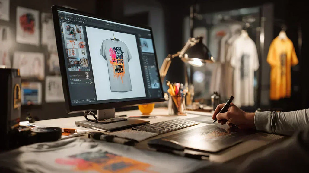
Whether you're launching a brand or ordering a one-off custom t-shirt print, your artwork needs to be print-ready. We'll walk you through how to get it there, avoiding the rookie mistakes that can sabotage your final result.
1️⃣ Resolution, Dimensions & Format — Getting the Basics Right
When it comes to DTG, size matters—especially at the pixel level. Your final print quality relies on a measurement called resolution, expressed in DPI (dots per inch). For clean, sharp prints, ensure your file is set to 300 dpi at the actual print size. That means if your design is intended to be 10 inches wide, your file should be at least 3000 pixels across. It's one of the most common mistakes we see—art that looks good on screen but turns out pixelated on fabric.
When saving your file, use a transparent PNG for simple uploads or one of the vector formats we support in the designer tool—AI, EPS, or CDR. These retain sharp edges and scale without loss of quality. Just make sure your fonts are outlined and all layers are flattened. This is especially important if you're launching your own brand or submitting files for customised hoodies and T-shirts.
📂 File Format Quick Guide
| Format | Supports Transparency | Scalable | Ideal For |
|---|---|---|---|
| PNG | ✅ Yes | ❌ No | Uploads with transparent backgrounds |
| AI | ✅ Yes | ✅ Yes | Vector logos, editable artwork |
| EPS | ✅ Yes | ✅ Yes | Industry-standard print files |
| CDR | ✅ Yes | ✅ Yes | CorelDRAW users |
| JPG | ❌ No | ❌ No | Not recommended |
❌ Avoid JPG files unless there’s absolutely no other option. They don’t support transparency and use lossy compression that can introduce unwanted blur or artefacts around your edges. To avoid errors, see our common design mistakes guide.
📋 DTG Artwork Checklist
| Requirement | ✅ Ready |
|---|---|
| 300 dpi at actual print size | ✅ |
| Transparent PNG or vector format | ✅ |
| Exact canvas size (no scaling) | ✅ |
| Flattened artwork (no live text or layers) | ✅ |
A perfect design deserves perfect preparation. When your file is set up properly, your print comes out sharp, clean, and exactly as intended—whether it's for one custom hoodie or a full custom t-shirt print. If you're unsure about formats or want to compare DTF or screen printing, check out our breakdown before uploading your artwork.
2️⃣ Understanding Colour: RGB, CMYK & Vibrancy
Most people assume that if their design looks great on screen, it will print just as brightly, but that's rarely the case. Achieving vibrant colours from a DTG print begins with understanding how colours are handled during the print process. File setup plays just as significant a role as the inks themselves.
Digital artwork is usually created in RGB colour mode, which is designed for screen display. However, many commercial DTG machines use CMYK inks for printing. That mismatch can lead to colours looking dull, flat, or totally off.
🖨️ Kornit Atlas Max: CMYKRGB hybrid
At The T-Shirt Bakery, our Kornit Atlas Max printers use a CMYKRGB hybrid colour channel, giving the best of both worlds. We recommend uploading RGB files for the most vibrant output. However, please check with your t-shirt printing provider if you're ordering elsewhere, as their requirements may differ.
🎨 Boost Saturation and Contrast
Before uploading, slightly boost your saturation and contrast. This compensates for how printers translate colour, helping preserve the detail and intensity you see on screen. Designs that haven't been adjusted often appear muted once printed, especially in areas with rich colours such as reds, purples, or pastels.
Choosing the correct mode and adjusting your levels ensures you get a high-quality print finish that does your artwork justice. Whether you're ordering a one-off or want to customise t-shirt printing for a full range, colour prep is key to standout results.
3️⃣ Transparency Mistakes That Kill Print Quality
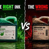
One of the most common errors in first-time t-shirt designs is unwanted transparency, particularly in areas that should be completely solid, such as white fills, lettering, or shapes. It might look perfect on screen, but when a DTG machine lays down an underbase, even a small amount of transparency can lead to washed-out tones or greyish whites.
This happens because the white base layer, which is crucial for colour accuracy on dark garments, won't print as pure white if your design isn't fully opaque. Instead, it prints as a slightly off-white base, causing the final colours to appear flatter, less vibrant, and sometimes completely off.
![]()
The left side of the image above shows how this can weaken the design’s impact, while the right side shows the crisp results of a properly prepared file.
To avoid this, check the opacity and fill levels on your design layers in Photoshop. Add a half background colour, which shows a clear edge line that runs through the design, revealing any hidden transparency. It's a quick trick that makes a big difference to the final print.
At The T-Shirt Bakery, we don't use alpha channels to define the white base layer and the image opacity—our advanced DTG software handles it automatically. However, if your chosen printer relies on alpha channels to control these aspects, it's worth checking your file's alpha channel to ensure it doesn't contain unwanted transparency before submitting your design.
For more tips, see our blog on common t-shirt design mistakes and learn how to prepare your artwork for print. You can also explore techniques for getting bold colour results or see how we handle bulk printing orders.
4️⃣ Editing Tips, Software, and File Checks Before You Print
Most issues with custom t-shirt printing don't start at the printer—they start in the software. Whether you're designing in Photoshop, Illustrator, Procreate, or a free tool like Canva, it's crucial to prepare your file correctly before uploading it to a print platform.

First, always flatten your layers and convert live text into outlines or shapes. This prevents accidental font swaps or layout glitches when the file is opened on another machine. Clear naming conventions (e.g. "Brand-Logo-Front-WhiteTee.png") help avoid mix-ups during the upload process, especially when ordering multiple designs.
If you're exporting from Photoshop, double-check that your PNG is saved at 300 dpi, in RGB mode, with transparency enabled. Canva users should avoid PDFs and always select PNG at the highest resolution. Procreate artists: Use the crop tool to remove any invisible canvas edges before exporting.
🧾 Pre-Print File Prep Checklist
| ✅ Task | 💻 Software Tips |
|---|---|
| Flatten layers | Avoid hidden edits or misprints |
| Outline fonts | Prevent font changes on other machines |
| Clear file names | Use a format like Brand-Logo-Front.png |
| Save at 300 dpi (PNG) | Photoshop: use RGB + transparency |
| Avoid PDFs | Canva: select PNG, highest resolution |
| Crop canvas edges | Procreate: remove extra invisible space |
| Check colour mode | RGB preferred for DTG printing |
| Test print first | One-off sample before bulk printing |
At The T-Shirt Bakery, our product designer tool makes uploading easy, but the quality of the end result still depends on the file you upload. Doing a one-off sample print before ordering a bulk order is a smart approach. This way, you can check the design and print before going into full production.
Before placing your order, don't forget to review our artwork guidelines to ensure everything is print-ready. The better your prep, the better your final print will look.
🤔 Final Thoughts
Perfect prints start long before ink hits fabric. In the world of custom clothing, your design file is your foundation, and skipping the prep work is the fastest way to waste time, money, and blank stock.
Whether you're creating print-on-demand merchandise, ordering uniforms, or testing a logo for your next range, the difference between 'just okay' and professional-grade results often comes down to how well your artwork is set up.
The process is simple, but it demands precision. Design with intention → size it correctly at 300 dpi → check colour mode (RGB for DTG) → flatten layers → review transparency → and test print when possible. Each step helps lock in clarity, vibrancy, and consistency across every garment.
To make it even easier, we've created a free downloadable PDF checklist to guide you through each stage. Keep it on hand whenever you're prepping artwork—it's the quickest way to avoid rookie mistakes and ensure your final print is just as sharp as your idea.
Because great prints don't happen by chance. They happen by design.

🧠 Frequently Asked Questions
Artwork Prep, Print Quality, and Common Issues—Answered Clearly


