


Why the Best Apparel Brands Are Designing Less - Not More
|
📚 In This Editorial 🧭 Clear Apparel Wins Faster ⚡ Instant Clothing Judgement 👕 Why Overdesigned Apparel Struggles |
🧠 Commercial Themes 🔤 Typography Communicates Faster 🧥 Wearability Over Novelty |
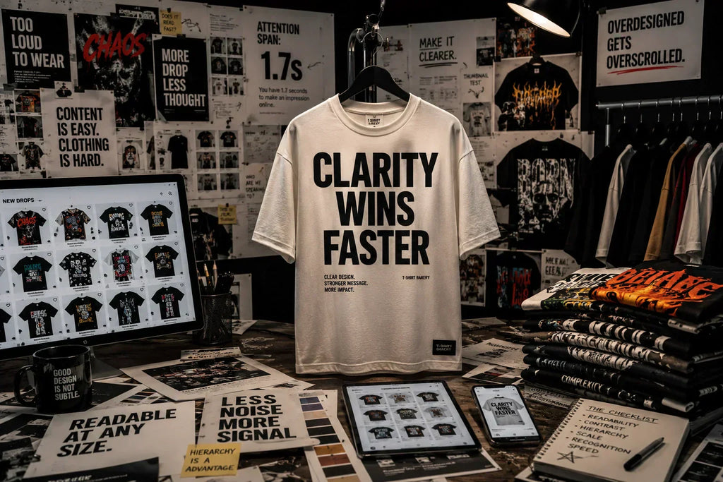
🧭 In a Scroll-Heavy World, Clear Apparel Wins Faster
Modern e-commerce changed how people experience clothing long before most apparel brands fully recognised it.
Products no longer enter consumer attention primarily through stores, rails, or carefully merchandised retail spaces. Consumers now encounter most apparel through storefront grids, mobile thumbnails, social feeds, creator drops, recommendation engines, and compressed-scrolling environments where products compete for recognition in seconds.
Consumers increasingly consume clothing as images before they experience it as garments.
That shift altered the commercial value of visual clarity far more than many brands anticipated.
The modern e-commerce environment is visually exhausting. Consumers move through endless product launches, oversized graphics, creator merchandise collections, aggressive streetwear aesthetics, algorithmic recommendations, and highly compressed mobile interfaces every day. Much of the apparel market now competes in environments where customers barely pause before continuing to scroll.
In overloaded systems like these, clarity starts outperforming complexity.
That does not necessarily mean minimalism became culturally dominant in the traditional sense. The stronger shift is behavioural rather than aesthetic. Cleaner apparel communicates faster. Simpler garments remain readable at thumbnail scale. More restrained products create less friction during rapid browsing, when customers make emotional judgements almost instantly.
Many apparel brands still design as though consumers are standing still.
Modern e-commerce has trained consumers to process products quickly, emotionally, and under increasingly compressed attention conditions. Recognition speed became commercially valuable because products now compete in environments overloaded with visual noise.
The strongest apparel brands increasingly understand that distinction. Cleaner collections create a stronger hierarchy. Typography-led garments remain recognisable at a smaller scale. More restrained merchandising systems often feel more wearable because they leave visual breathing room around the product itself rather than competing constantly for attention.
The commercial advantage no longer comes from shouting the loudest.
Increasingly, it comes from communicating clearly before attention disappears altogether.
⚡ E-commerce Trained Consumers to Judge Clothing Instantly

Mobile-first commerce compressed apparel decision-making far more aggressively than many fashion businesses initially expected. Consumers now encounter clothing inside systems designed around speed rather than contemplation. Storefront grids, social feeds, creator pages, and marketplace layouts all reward rapid-scanning behaviour, in which products receive only brief moments of attention before users move on.
That environment changed how apparel performs commercially online.
Products increasingly compete at thumbnail scale long before customers examine the garment itself more closely. Hierarchy, readability, silhouette clarity, and visual cohesion often matter more during those early interactions than intricate detail that only becomes visible after extended viewing. Certain garments withstand compression better than others because the product still communicates clearly when reduced to a small image among competing alternatives.
Many e-commerce businesses still underestimate how heavily modern browsing behaviour depends on instant visual processing.
Consumers rarely analyse products sequentially anymore. They filter quickly. They scan for recognisable signals. Stronger products often communicate almost immediately because the design system leaves enough space for recognition to happen without excessive visual effort.
Overdesigned apparel frequently struggles under those conditions.
Graphics become unreadable on smaller screens. Excessive detail collapses at thumbnail scale. Multiple competing elements fight for attention simultaneously. Products designed to feel “attention-grabbing” sometimes become harder to process because too much information is presented to the customer at once.
Research published in the Journal of Consumer Research on choice overload and decision friction helps explain part of this behaviour. Excessive choice and excessive complexity often increase cognitive fatigue rather than improving engagement. Modern e-commerce intensifies that pressure because consumers now process enormous volumes of visual information continuously across multiple platforms throughout the day.
The strongest brands increasingly understand that visual clarity itself has become commercially useful.
Not because consumers suddenly stopped appreciating creativity.
Overloaded ecommerce environments changed how quickly products need to communicate before attention disappears entirely.
👕 Why Overdesigned Apparel Often Performs Worse in Real Use

Many garments perform well as digital concepts but function far less effectively as clothing people genuinely want to wear repeatedly.
That tension became increasingly visible as social-first commerce pushed apparel closer toward content behaviour. Products are now often designed for launch-day visibility, algorithmic engagement, screenshots, or promotional imagery rather than long-term wearability in everyday wardrobes.
Creator merchandise now resembles digital content more than wearable apparel.
Graphics become denser. References become more layered. Visual intensity increases because products compete heavily for attention during launches and social promotion cycles. Certain garments generate an immediate online reaction yet become surprisingly difficult to style, rewear, or integrate naturally into an everyday clothing rotation afterwards.
Consumers rarely describe this behaviour directly, but purchasing patterns increasingly reveal it.
Many people no longer want every garment to behave like content.
Wearability became commercially valuable again because overloaded wardrobes now create fatigue similar to that in overloaded e-commerce environments. Cleaner products often last longer because they create less friction with repeated use. Simpler garments integrate more naturally across different settings, remain easier to style consistently, and continue functioning after novelty fades.
According to McKinsey's State of Fashion analysis, fashion businesses continue operating under growing pressure from accelerating trend cycles, shifting consumer expectations, and increasingly crowded markets. Many brands respond to that pressure by adding more visual intensity, more references, and greater design complexity to maintain visibility.
That strategy often worsens the underlying problem.
Consumers already operate inside environments saturated with visual stimulation before they even open an apparel storefront. Social platforms, advertisements, creator feeds, recommendation systems, and ecommerce marketplaces all compete continuously for attention throughout the day. Clothing entering that ecosystem carrying even more visual overload does not always create stronger engagement. In many cases, it simply creates more fatigue.
The strongest apparel brands increasingly understand that wearable clarity creates a different kind of commercial value.
Not quieter because quieter feels safer.
Clearer because overloaded environments changed what consumers process most comfortably and repeatedly over time.

🔤 Typography-Led Apparel Works Because It Communicates Faster
Typography-led apparel succeeds commercially for reasons extending far beyond aesthetics alone.
At its best, typography functions as an efficient communication system in compressed e-commerce environments where products compete rapidly and often on a very small scale for recognition. Strong hierarchy, controlled spacing, restrained layouts, and readable compositions allow garments to communicate quickly across storefront grids, mobile screens, social feeds, and distance-viewing conditions, where clarity matters more than intricate visual detail.
Typography survives compression well.
Many heavily illustrated garments lose recognisability when reduced to thumbnail scale because too many visual elements compete. Strong typographic systems often remain readable even during rapid scrolling conditions because the information architecture itself stays cleaner.
That speed matters commercially.
Modern ecommerce increasingly rewards products capable of creating recognition before attention disappears. Typography-led apparel often performs strongly because it reduces visual friction rather than increasing it. Customers understand the garment quickly without needing to decode multiple competing graphics, references, or layered visual systems.
The strongest typography-led brands also understand restraint as a merchandising advantage rather than simply an aesthetic preference. Negative space became commercially valuable because visual breathing room improves recognition across crowded storefront environments. Cleaner garments often feel more premium because the design appears deliberate, controlled, and easier to process at first glance.
Many brands mistakenly associate complexity with creativity.
In practice, some of the strongest apparel systems rely on remarkably disciplined editing. Typography-led apparel often succeeds because it behaves more like communication design than decorative design. Hierarchy remains controlled. Recognition happens quickly. Products retain wearability even after trend cycles shift.
That does not mean maximalist apparel disappears entirely. Certain brands still succeed through visual intensity because their cultural identity depends on it. The broader commercial shift, however, increasingly favours products that balance personality with clarity rather than overwhelming customers with constant visual stimulation.
The strongest apparel brands are not necessarily less creative in their design.
More often, they are editing more aggressively before products ever reach the storefront.
🧥 Wearability Became More Valuable Than Novelty

Modern consumers already encounter extraordinary amounts of visual stimulation before they purchase a single garment. Social feeds, entertainment platforms, ecommerce marketplaces, creator ecosystems, recommendation engines, and digital advertising systems all compete continuously for attention throughout the day.
Clothing now enters that environment, carrying additional psychological pressure.
That shift helps explain why more restrained apparel increasingly feels commercially resilient. Cleaner garments integrate more naturally into repeated wear. Simpler branding systems remain easier to expand consistently across collections. Typography-led apparel often creates stronger merchandising cohesion because products support each other visually rather than competing aggressively for isolated attention.
Wearable products create stronger long-term customer relationships than purely attention-driven products.
That distinction matters particularly within print-on-demand and creator-led commerce, where storefront expansion has become remarkably easy. Many businesses now release products continuously because the e-commerce infrastructure rewards constant novelty operationally. Yet endless product generation often weakens collection cohesion, bestseller visibility, and overall storefront clarity underneath the surface.
Strong merchandising increasingly depends on editing.
The best apparel brands are not necessarily creating fewer ideas internally. More often, they are becoming more selective about which ideas deserve operational attention, storefront visibility, and long-term brand association. Cleaner collections improve product hierarchy. More cohesive storefronts improve recognition consistency. Stronger editing reduces visual noise across the entire customer experience.
In overloaded e-commerce environments, clarity became commercially valuable because attention itself became unstable.
Consumers increasingly gravitate toward products that feel easier to process, easier to wear, and easier to integrate into everyday life without demanding constant visual attention.
The strongest apparel brands increasingly recognise that distinction.
They are not necessarily designing quieter products because quiet design has become fashionable.
They are designing clearer products because modern e-commerce has become overwhelmingly loud.
-
Posted in
Creative Identity, Design Culture


